How Kraft Boxes Can Create a Natural Brand Look
31 Aug, 2026
521 Views 0 Like(s)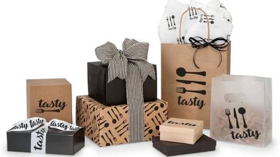
Kraft boxes help brands create a natural look because of their raw texture, earthy color, and simple finish. They work best with clean typography, limited colors, and minimal design details. This makes them a strong choice for brands that want packaging to feel handmade, organic, or honest.
Brands use packaging to set the tone before a customer opens the product. Kraft boxes do this well because they feel simple, honest, and close to the material itself. The brown paper surface, visible fiber texture, and matte finish make the box look less processed than a glossy carton. That is why kraft packaging often fits products that want a handmade, organic, or clean visual identity.
The natural look does not come from kraft paper alone. It comes from the way the box is designed, printed, and finished. A plain kraft box can look rough if the layout is crowded or the printing is too heavy. The same box can look refined when the typography is clean, the colors are restrained, and the packaging matches the rest of the brand.
Why kraft boxes feel natural
Kraft paper has a color and texture that people already associate with raw materials. It does not try to hide the surface. That is part of the appeal. The warm brown shade works well with products that want to communicate simplicity, care, or a small-batch feel.
The material also creates a strong base for earthy branding. Black ink, white ink, muted green, beige, terracotta, and soft gray all sit comfortably on kraft stock. The box does not need much decoration to look complete. In fact, too much decoration usually works against the natural feel.
This is why kraft boxes are common in categories like soaps, candles, tea, coffee, bakery items, skincare, and handmade goods. These products often benefit from packaging that looks grounded and direct rather than overly polished.
Design choices that support the look
A natural brand look depends on restraint. The design should let the kraft texture stay visible instead of covering it with heavy graphics.
Simple typography works better than complex fonts. Sans serif typefaces, clean serif fonts, or a short handwritten accent can all work if they are used with control. The key is to keep the layout easy to scan. A cluttered front panel can make the box feel less authentic, even if the material is kraft.
Whitespace matters too. Leaving open space around the logo or product name gives the package room to breathe. It also makes the box look more intentional. A centered logo, a small brand mark, or a quiet pattern can be enough.
Illustrations can help when they are relevant to the product. Line drawings of herbs, leaves, ingredients, or tools fit naturally on kraft packaging. Labels, stamps, and small icons can also support the look, especially for brands that want a craft-inspired or artisanal style.
Color choice should stay limited. One or two ink colors usually work better than a full printed design. Full coverage printing can hide the kraft surface and remove the effect that makes the box feel natural in the first place.
Printing and finishing that keep the texture visible
Printing on kraft paper needs balance. Dark text usually gives strong contrast, while white ink can create a clean and calm look. If the design uses too many shades, the result can feel busy or off-brand. A small color palette helps the box stay consistent across different product lines.
Finishing choices matter as well. A matte surface usually fits the natural style better than glossy lamination. If the box needs protection, a light coating can still keep the appearance simple. The goal is not to make the surface shiny or plastic-like.
Embossing and debossing are useful when a brand wants texture without extra color. A raised logo or pressed-in brand mark can add depth while keeping the design quiet. Foil can also work, but only in small amounts. If the metallic effect becomes the main feature, the natural feel drops away.
Die-cut windows are another useful option. They let the customer see part of the product while keeping the kraft box as the main visual layer. For food items, candles, or small retail products, this can create a clean balance between practicality and presentation.
Where kraft boxes work best
Kraft boxes suit brands that want their packaging to feel close to the product story. That includes brands built around natural ingredients, simple formulas, handmade production, or locally made items.
They work well for:
- Organic skincare and soap
- Candles and home fragrance
- Tea, coffee, and dry food items
- Bakery packaging
- Handmade gifts and crafts
- Small apparel items and accessories
- Wellness products with a clean visual style
The common thread is not the product category itself. It is the message behind the packaging. Kraft boxes help when the brand wants to look approachable, thoughtful, and grounded.
How to keep the brand consistent
A natural look only works when the packaging system stays consistent. If the outer box feels calm but the insert, sticker, and shipping carton look unrelated, the brand loses impact.
Consistency starts with the same paper tone, print style, and logo placement across all packaging. The inside of the box should also match the outside. Recycled tissue paper, plain inserts, small thank-you cards, and simple paper stickers can support the same visual language.
Brands should also keep the design logic aligned across digital and physical touchpoints. The website, product photos, social media graphics, and packaging should use similar colors and type choices. That does not mean everything must look identical. It means the customer should feel the same tone at every point.
Common mistakes to avoid
The biggest mistake is overdesigning the box. Kraft packaging already has visual character. It does not need heavy decoration to stand out.
A few common problems weaken the natural look:
- Too many colors on one box
- Glossy lamination that hides the paper surface
- Crowded layouts with too much text
- Fonts that feel decorative but hard to read
- Large logos that overpower the material
- Mixed design styles across product lines
- Overused eco claims that feel forced
Another issue is using kraft paper without thinking about the product itself. A natural look should still feel appropriate. A brand that sells minimal, modern products may need a cleaner layout than a brand selling handmade goods. The box should reflect the product and the audience, not just the material.
What makes kraft packaging feel authentic
Authenticity comes from consistency between material, message, and design. Kraft boxes work because they make the packaging look closer to the product and less like a layer added for effect.
A simple logo, a clear type layout, and a limited color palette can say more than a crowded design. When the box lets the paper texture stay visible, it feels more grounded. When the finish stays matte and the branding stays focused, the package looks deliberate without feeling loud.
FAQ
What colors work well on kraft boxes?
Black, white, deep green, muted red, beige, and dark brown usually work well. These shades keep the design clear without covering the natural surface of the paper.
Do kraft boxes only suit eco-focused brands?
No. They work for any brand that wants a clean, handmade, earthy, or simple look. Many product types use kraft packaging for style, not just for material choice.
Can kraft boxes look polished?
Yes. Clean printing, good structure, neat typography, and careful finishing can make kraft packaging look well-made while still keeping the natural tone.
Kraft boxes create a natural brand look when the design stays simple and the paper texture remains part of the presentation. The material gives the box its base character, but the print, finish, and layout decide how that character shows up. Brands that want packaging with a calm and honest feel usually get the best results when they keep the design focused and consistent.
If you want, I can also turn this into a more sales-focused website page, a blog format, or a product category page


Comments
Login to Comment