How Indoor Office Signage Creates a More Organised Workplace
04 Nov, 2026
9 Views 0 Like(s)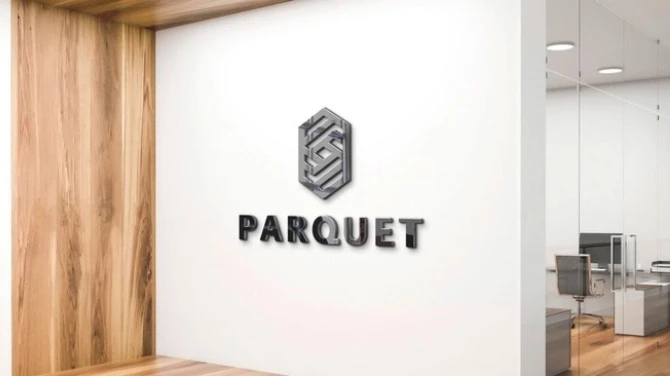
Indoor office signage plays an important role in achieving this by identifying rooms, displaying directions, sharing important information, and creating
A well-planned office should help employees work comfortably and allow visitors to find the right place without confusion. Indoor office signage plays an important role in achieving this by identifying rooms, displaying directions, sharing important information, and creating a consistent appearance throughout the workplace. From reception signs and department labels to meeting room displays and safety notices, each sign has a practical purpose. When the design, wording, materials, and placement are carefully considered, office signs can make daily activities easier while giving the interior a more organised look.
1. Why Indoor Office Signage Matters in Modern Workplaces
Office buildings often contain several departments, meeting rooms, shared facilities, and restricted areas. Without clear signs, visitors may need to ask employees for directions, while new staff members can find it difficult to understand the layout. Indoor office signage helps solve these problems by providing information at the places where people need it.
Consider a company with three floors and separate departments for sales, accounts, administration, and management. A visitor arriving for a meeting may not know which floor to visit or where to wait. Clear signs at the reception desk, lift lobby, and corridor can guide that person without requiring constant assistance.
Employees also benefit from organised signs. Room labels make it easier to locate meeting spaces, while department signs help staff identify work areas. In larger offices, consistent signs can reduce interruptions and save time during everyday activities.
The value of office signage is not limited to navigation. It can also communicate workplace rules, identify emergency equipment, display company values, and make shared spaces easier to use. A thoughtful signage system supports both the practical and visual needs of an office.
2. Different Types of Signs Used Inside Offices
An effective office signage system usually includes several types of signs. Each one should serve a clear purpose rather than simply fill an empty wall.
Reception and entrance signs
The reception area is often the first place visitors see when entering an office. A sign displaying the company name or logo helps identify the organisation and creates a clear starting point for visitors.
Reception signs can use acrylic lettering, metal finishes, raised letters, printed panels, or illuminated elements. The right choice depends on the interior design, wall surface, lighting, and available space.
For example, a small consultancy may use simple raised lettering behind its reception desk, while a large corporate office may install a larger feature panel with its name and logo.
Department and room identification signs
Department signs identify specific work areas, such as human resources, finance, customer service, and administration. Room signs can also display names or numbers for meeting rooms, private offices, and shared facilities.
A consistent format helps people recognise these signs quickly. Using the same font, colour scheme, and layout throughout the building also makes the workplace look more organised.
Directional and wayfinding signs
Directional signs guide people through corridors, floors, entrances, and shared spaces. They are especially useful in offices with several departments or multiple floors.
A simple sign at a corridor junction might point towards meeting rooms, restrooms, lifts, and the main exit. Arrows should be clear and positioned before visitors reach the point where they need to make a decision.
Safety and regulatory signs
Safety signs communicate important instructions and warnings. Examples include fire exit directions, emergency assembly information, first-aid locations, electrical hazard warnings, and restricted-area notices.
These signs should use recognised symbols and clear wording. Decorative design should never reduce the visibility of essential safety information.
3. Choosing Suitable Materials and Finishes
The material used for a sign affects its appearance, durability, cleaning requirements, and overall suitability for the office environment. Indoor signs are not exposed to the same weather conditions as exterior signs, but they still need to withstand regular handling, cleaning, and everyday use.
Acrylic signs
Acrylic is widely used for office signs because it has a smooth surface and is available in different colours, thicknesses, and finishes. It can be cut into custom shapes and used for reception displays, room labels, wall signs, and directional panels.
Clear acrylic can create a modern appearance, while coloured or frosted options provide different visual effects. Raised acrylic letters can also add depth to a company logo or office name.
Metal signs
Metal signs are suitable for workplaces that prefer a clean and durable finish. Stainless steel and aluminium are common choices for room identification, reception displays, and directory panels.
Brushed metal can create a subtle appearance, while polished finishes provide a more reflective surface. The lettering and background should have enough contrast to remain readable under the office lighting.
Vinyl lettering and printed panels
Vinyl lettering can be applied to glass partitions, walls, doors, and prepared panels. It is useful for displaying room names, working hours, privacy information, and short instructions.
Printed panels are suitable when a sign contains several colours, icons, or detailed information. Before production, the artwork should be checked to ensure that the text remains readable at the final size.
Wood and decorative materials
Some workplaces use wooden signs to create a warm or natural interior appearance. Wood can work well in creative studios, hospitality offices, and spaces with a relaxed design style.
The material should match the office environment. A decorative wooden room sign may suit a private meeting area, while a high-traffic corridor may need a surface that is easier to clean and maintain.
4. Planning a Consistent Office Signage Design
A collection of signs can become confusing when every department uses a different font, colour, or layout. A consistent design system makes information easier to recognise and creates a more unified interior.
Businesses planning custom signage dubai projects for their office interiors should begin by identifying the information visitors and employees need most often. This may include the reception location, department names, floor numbers, meeting rooms, restrooms, and emergency routes.
Establish a clear visual hierarchy
The most important information should be the easiest to notice. On a department sign, the department name should be more prominent than secondary details. On a directional sign, the destination and arrow should receive the most attention.
Using different text sizes can help organise information. However, too many font styles and decorative effects may make the sign difficult to read.
Choose colours with enough contrast
Text should stand out clearly from its background. Dark letters on a light surface and light letters on a dark surface are common combinations because they are easy to distinguish.
Colour can also help identify different departments or floors. For example, a company may use one colour for meeting areas and another for employee facilities. The system should remain simple and consistent.
Use symbols where they improve understanding
Recognisable symbols can communicate information quickly. Restroom icons, lift symbols, accessibility signs, and directional arrows are useful examples.
Symbols should support written information rather than replace necessary instructions. If a symbol may be unfamiliar to visitors, adding a short label can make its meaning clearer.
5. How to Place Signs for Better Navigation
A sign is only useful when people can see it at the right moment. Placement should be planned around how employees and visitors move through the office.
At the entrance, visitors should be able to identify the reception area without searching. Near lifts and staircases, floor directories can explain which departments are located on each level. At corridor intersections, directional signs should appear before people need to choose a route.
Room signs are usually most useful beside the door or near the entrance to the room. They should not be hidden behind an open door, furniture, or decorative features.
Consider viewing distance and height
The size of the lettering should match the distance from which people will read it. A large directory mounted in a lobby needs different text dimensions from a small label placed beside a meeting room.
Signs should also be installed at a comfortable viewing height. People using wheelchairs or other mobility aids should be able to access important information where possible. Accessibility requirements should be considered during the planning stage.
Avoid unnecessary signs
Adding too many signs can make an office feel cluttered. When every wall contains several messages, visitors may struggle to identify the information that matters.
A better approach is to place signs at key decision points and use directories where several destinations need to be listed. Repeated messages should be limited to situations where they genuinely improve safety or navigation.
6. Indoor Signs for Different Office Areas
Each area of a workplace has its own information requirements. Planning signs according to their location helps prevent unnecessary messages and improves everyday use.
Reception and waiting areas
Reception signs should identify the company and make the front desk easy to locate. A separate visitor instruction sign can explain whether guests should check in, wait, or contact an employee.
In a shared office building, clear tenant directories are also useful because several businesses may operate from the same floor.
Meeting and conference rooms
Meeting room signs can display room names, numbers, or availability information. Some offices use digital displays outside conference rooms to show booking schedules.
A simple example is a sign reading “Meeting Room 2” with a small display indicating whether the room is occupied. This helps employees avoid interrupting meetings or entering the wrong space.
Corridors and shared facilities
Corridors often connect several departments and facilities. Directional signs should help people move through these areas without repeatedly asking for assistance.
Restrooms, kitchens, prayer rooms, storage areas, and staff facilities should also be clearly identified. In larger offices, floor directories can provide an overview of the available spaces.
Private and restricted areas
Some rooms are intended only for authorised employees. Signs such as “Staff Only”, “Private Office”, or “Authorised Personnel” help communicate access restrictions.
These messages should be direct and easy to understand. Where additional security is required, signage should support rather than replace access-control systems.
7. Improving Workplace Accessibility and Safety
Office signs should work for people with different needs and levels of familiarity with the building. Clear wording, readable text, suitable contrast, and thoughtful positioning all contribute to accessibility.
Where required, tactile lettering and Braille can help people with visual impairments identify rooms and facilities. The specifications for these features should follow the applicable accessibility standards.
Safety information needs particular attention. Emergency exits, fire equipment, first-aid points, and evacuation routes should be identified using appropriate signs. These should remain visible and should never be covered by furniture, decorations, or temporary notices.
For example, a company renovating its office may move desks and partitions. Before employees return, the management team should check whether emergency signs are still visible and whether directional information reflects the updated layout.
Good signage planning also considers visitors who may not understand the building's internal terminology. Simple descriptions such as “Reception”, “Lift”, and “Meeting Rooms” are usually more helpful than unfamiliar department abbreviations.
8. Production, Installation, and Maintenance
Producing office signs involves several steps. The process normally begins with a site assessment and a list of the signs required. Measurements are then taken, designs are prepared, and materials are selected according to the location and purpose of each sign.
Before manufacturing begins, the final artwork should be reviewed carefully. Spelling mistakes, incorrect room numbers, outdated department names, and inconsistent logos can create problems after installation.
A useful production checklist includes:
-
Confirming the wording and spelling of every sign.
-
Checking dimensions and installation locations.
-
Reviewing colours, fonts, symbols, and logos.
-
Selecting suitable materials and finishes.
-
Confirming wall surfaces and mounting methods.
-
Checking whether any signs require special accessibility features.
For example, a company moving into a new office may need 25 room labels, two floor directories, one reception display, and several safety signs. Preparing a complete list before production helps prevent missing signs and inconsistent designs.
When comparing local suppliers, businesses may look at examples from companies such as Zahrat Al Madina Printing alongside other providers to understand available materials, finishing options, and production methods.
Maintaining signs over time
Indoor signs usually require less maintenance than exterior displays, but regular checks are still useful. Dust can collect on surfaces, adhesive lettering may lift at the edges, and room information can become outdated when departments move.
A simple inspection every few months can help identify damaged panels, loose fixings, faded graphics, and incorrect information. Signs should be cleaned with products suitable for their materials to avoid scratching or damaging their finishes.
Conclusion
Indoor office signage helps create a workplace that is easier to navigate, more organised, and more comfortable for employees and visitors. Reception displays, room labels, directional signs, safety notices, and department directories each support a different part of daily office activity.
The most effective system begins with a clear understanding of the building and the people who use it. Suitable materials, readable lettering, consistent colours, accessible placement, and accurate information all contribute to better results. By planning signs carefully and maintaining them as the office changes, businesses can create an interior environment where people can find the information and spaces they need without confusion.

Comments
Login to Comment