How Do You Choose the Right Sign Board for Your Business?
12 Nov, 2026
3Views 0 Like(s)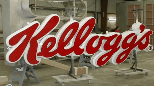
a well-planned sign board should communicate its message clearly and suit the environment around it.
A business sign does more than display a company name. It helps visitors identify a location, understand what a business offers and recognise its brand. Whether installed outside a shop, inside an office or along a corridor, a well-planned sign board should communicate its message clearly and suit the environment around it. Choosing the right option involves several decisions, including the material, size, lettering, colours and installation method. A sign that looks attractive on a computer screen may not work as well when viewed from a distance or placed under strong sunlight. Understanding the available options makes it easier to select a design that serves a practical purpose, remains readable and fits the character of the premises.
1. What Is a Sign Board and What Is It Used For?
A sign board is a display panel or structure that communicates information through text, graphics, symbols or a combination of these elements. Businesses use signs to identify their premises, advertise services, guide visitors and provide important information.
The design and construction depend on where the sign will be installed. A small panel beside an office door has different requirements from a large exterior display facing a busy road.
Business Identification
One of the most common uses is displaying a business name and logo. Shops, restaurants, clinics and offices use exterior signs to help customers recognise their premises.
For example, a clothing shop in a row of retail units may use a clear fascia display above its entrance. A visitor can identify the correct shop without needing to check every doorway.
The design should make the business name easy to read. Decorative elements can support the branding, but they should not make the main information difficult to understand.
Sharing Information
Signs can also display opening hours, contact details, service information and safety instructions. These are useful in locations where visitors need basic information before entering or approaching staff.
A reception area might display visitor instructions, while a restaurant could use a panel to identify its ordering counter. The amount of information should remain appropriate to the viewing distance and purpose.
Directing Visitors
Large buildings often need several signs to guide people towards their destinations. Arrows, floor numbers, room labels and directories help visitors understand where they need to go.
A well-organised system is particularly useful in hospitals, shopping centres, office buildings and educational facilities, where people may not know the layout.
2. Which Types of Signs Are Available?
There is no single design suitable for every business. The right type depends on the location, intended message, available space and desired appearance.
Outdoor Signs
Outdoor signs identify businesses from streets, car parks and building entrances. They need to remain readable in changing light and withstand exposure to dust, sunlight and weather.
Common examples include:
-
Shop fascia signs.
-
Building name panels.
-
Entrance signs.
-
Illuminated business displays.
-
Freestanding directional signs.
-
Window graphics and promotional panels.
The size should relate to the viewing distance. A sign above a small doorway does not need the same dimensions as a display positioned high on a commercial building.
Indoor Signs
Indoor signs help visitors navigate a building and understand its layout. They can also reinforce the visual identity of a business.
Reception logos, department labels, room numbers, meeting room signs and floor directories are common examples.
Consistency matters in these environments. If each department uses a different font, colour or sign style, visitors may find the building less organised.
Illuminated Signs
Illuminated signs use lighting to make information visible in low-light conditions. They are common outside restaurants, retail outlets, hotels and commercial buildings.
LED lighting is often used because it can fit within relatively compact sign structures. However, the brightness and placement should be considered carefully. Excessive illumination may distract people or make the display uncomfortable to view.
Directional and Safety Signs
Directional signs guide people towards specific locations, while safety signs communicate warnings, restrictions and emergency information.
A warehouse may use arrows to identify loading areas and storage sections. A commercial building may display emergency exits and fire equipment locations.
Safety signs should follow relevant requirements and use recognised symbols where applicable. They should also remain visible rather than being hidden behind furniture, doors or promotional displays.
3. How Do Materials Affect Sign Quality and Durability?
Material selection influences the appearance, weight, maintenance and expected lifespan of a sign. A material suitable for an indoor reception display may not be the best choice for an exposed outdoor installation.
Acrylic
Acrylic is widely used for office displays, retail signs, reception logos and individual lettering. It has a smooth surface and can be produced in different colours, thicknesses and shapes.
It can be printed, cut into letters or assembled in layers to create a raised appearance. Clear acrylic is also useful when a design needs a transparent or glass-like effect.
However, acrylic can scratch if cleaned with abrasive products. The grade should also be suitable for the intended exposure, particularly when used outdoors.
Aluminium
Aluminium is a practical choice for many commercial applications because it is relatively lightweight and can be finished in different ways. It is used for flat panels, lettering, building identification and directional displays.
A suitable coating helps protect the surface, while the thickness should match the size and construction of the sign.
Businesses considering aluminium signage should also check the quality of the edges, fixings and finish. These details influence both appearance and long-term performance.
Stainless Steel
Stainless steel creates a more solid and refined appearance. It is commonly selected for corporate offices, hotels, reception areas and premium commercial interiors.
Brushed, polished and coloured finishes offer different visual effects. Individual metal letters can also be mounted on walls to create a dimensional display.
The material can be heavier and may cost more than some alternatives, so the mounting surface and installation method need proper attention.
PVC and Foam-Based Materials
PVC panels are used for certain indoor and outdoor displays. They can be shaped and printed, making them suitable for temporary promotions, information panels and selected commercial applications.
Foam-based boards are generally more appropriate for lightweight indoor displays, exhibitions and short-term promotional use. They should not be selected for demanding outdoor conditions unless the specific product is designed for them.
4. How Should You Plan the Design and Printing?
A successful design begins with a clear purpose. Before selecting colours or fonts, decide what the sign needs to communicate and who will be reading it.
Define the Main Message
Every sign should have a primary purpose. A business identification panel needs to show the name clearly, while a directional display needs to make the route easy to understand.
Trying to communicate too many things on one panel can create a crowded appearance. If a business needs to display its name, services, telephone number and promotional offers, separate displays may be more effective.
Choose Readable Fonts and Colours
The lettering should be easy to recognise from the expected viewing distance. Simple fonts generally work better for signs that people need to read quickly.
Colour contrast is equally important. Dark lettering on a light background or light lettering on a dark background can improve readability.
The colours should also suit the business identity. A children's activity centre may use a brighter palette, while a legal office may prefer a more restrained design.
Check the Artwork Before Production
Artwork should be reviewed carefully before printing or fabrication. Spelling errors, incorrect telephone numbers and poorly aligned logos can make a finished sign look unprofessional.
For larger signs, vector artwork is often useful because it allows the design to be resized without losing the quality of its outlines.
The final proof should include the correct dimensions, colours, wording and logo placement. This is especially important when a design contains several elements or uses custom lettering.
Understand the Printing Method
Different production methods suit different materials and designs. Direct printing can be used on compatible flat surfaces, while vinyl graphics may be applied separately. Individual letters can be cut and mounted to create a raised finish.
When comparing sign board printing options, businesses should ask about the material, print quality, surface preparation and suitability for the installation environment.
A printed panel intended for outdoor use may require different inks or protective finishing from one displayed inside an air-conditioned office.
5. Where Should Different Business Signs Be Installed?
Placement affects how easily people can notice and understand a sign. Even a well-produced display may be ineffective if it is hidden, positioned too high or installed after visitors have already passed the point where they need information.
Shop Entrances and Building Exteriors
Exterior displays should be positioned where people can see them while approaching the premises. The available fascia space, neighbouring signs and surrounding architecture all influence the layout.
A retail shop on a busy street may need larger lettering than a business located inside a shopping centre. The sign should also remain proportionate to the building rather than dominating the entire façade.
Reception and Office Interiors
An office sign board can display the company name, logo or department information. It is often placed behind the reception desk, near the main entrance or beside an office door.
The material and finish should complement the interior. Raised acrylic letters may suit a modern reception, while a brushed metal panel may work better in a formal corporate setting.
For room identification, consistent positioning and lettering help visitors locate meeting rooms and departments without asking for directions.
Corridors and Shared Buildings
Directional displays should be installed before important junctions, lifts and changes of route. A visitor needs time to read the information and choose the correct direction.
In a multi-tenant building, directories should be updated when businesses move or change their office numbers. Outdated information can cause unnecessary confusion.
Exhibition and Event Spaces
Temporary displays are useful at trade fairs, conferences and promotional events. They may include company names, product information, booth numbers and directional messages.
Lightweight panels are often easier to transport and assemble. However, the display should remain stable and readable under the lighting conditions of the venue.
6. What Is a Custom Wayfinding Sign Board?
A custom wayfinding sign board is designed around the layout and needs of a particular building rather than using a generic directional template. It helps people move between entrances, departments, floors and facilities.
This type of signage is useful in places where visitors may need several directions before reaching their destination.
Planning the Visitor Route
The first step is to understand how people move through the building. Identify the main entrance, reception, corridors, lifts, stairs and important destinations.
For example, a medical centre may need signs directing visitors from the entrance to reception, then towards consultation rooms and diagnostic departments. Each sign should provide the information needed at that stage.
Using Clear Labels and Arrows
Short wording and familiar symbols make directions easier to understand. A sign showing "Reception" with a clear arrow is generally more useful than a long sentence explaining the route.
Floor numbers and department names should remain consistent throughout the building. If a department is called "Customer Services" on the entrance directory, the same name should appear on corridor signs.
Considering Accessibility
Visitors have different reading abilities and physical needs. Text should be large enough to read comfortably, with suitable contrast between the lettering and background.
Depending on the building and applicable accessibility requirements, tactile lettering, raised characters and Braille may also be appropriate.
Colour coding can help distinguish floors or departments, but essential directions should never rely on colour alone.
7. How Can You Choose the Right Signage Supplier?
Selecting a supplier involves more than comparing prices. Businesses should understand what is included in the quotation and whether the proposed materials and production methods suit the project.
Review Relevant Samples
Ask to see examples of similar work. A supplier experienced in flat printed panels may not necessarily specialise in illuminated lettering or complex metal fabrication.
Review the finish, edges, colour consistency, lettering and overall construction. If possible, examine a physical sample rather than relying entirely on photographs.
Confirm Materials and Specifications
The quotation should explain the material, thickness, dimensions, printing method and finishing details. For illuminated signs, it should also describe the lighting components and electrical requirements.
Businesses in Dubai can compare local providers, including Zahrat Al Madina Printing, when reviewing options for printed and fabricated business displays.
Discuss Installation and Maintenance
Ask whether installation is included and what preparation is required at the site. Large signs may need specialist equipment, suitable wall supports or electrical work.
It is also worth understanding how the sign can be cleaned, repaired or updated. A directory that needs frequent changes may benefit from replaceable panels rather than a permanently fixed design.
Check Approvals Before Production
Some buildings have rules about sign dimensions, colours, placement and fixing methods. External commercial signs may also require approval from the relevant authorities.
Confirm the requirements before production begins. This reduces the risk of having to alter or remove a sign after installation.
Conclusion
Choosing the right sign involves balancing appearance, readability, material quality and practical requirements. Businesses should begin by identifying the purpose of the display and the people who will use it. From material selection and artwork preparation to installation and maintenance, every stage affects the final result. A simple, clearly positioned design often communicates more effectively than a crowded display. By checking the location, viewing distance, building requirements and production specifications before ordering, businesses can select signage that supports their identity and serves visitors well over time.


Comments
Login to Comment